
Pharos Component Library
A style guide + component library specialized for cloud security SaaS products
Project Goal
Improve visual design, consistency and usability throughout the OpsCompass product
Strategy
- Design a style guide and component library in Figma
- Create an implementation strategy with front-end developers
- Provide a foundation to improve and scale the system
The Struggle: No Beacon in Sight
—
Joining OpsCompass as its first and only product designer, I made a 90-day plan to design a component library from scratch. The product was plagued with inconsistent styles that added to an ever-increasing pile of tech debt, and the engineering team needed help.
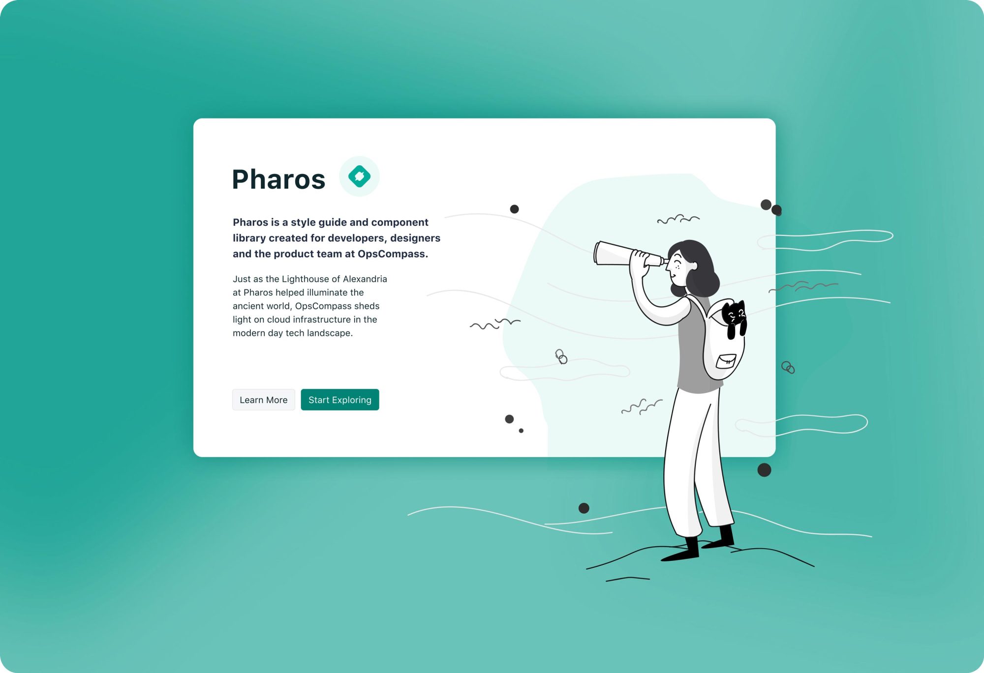
Enter Pharos: a style guide and component library that could shed light in times of uncertainty.

Phase I: Style
—
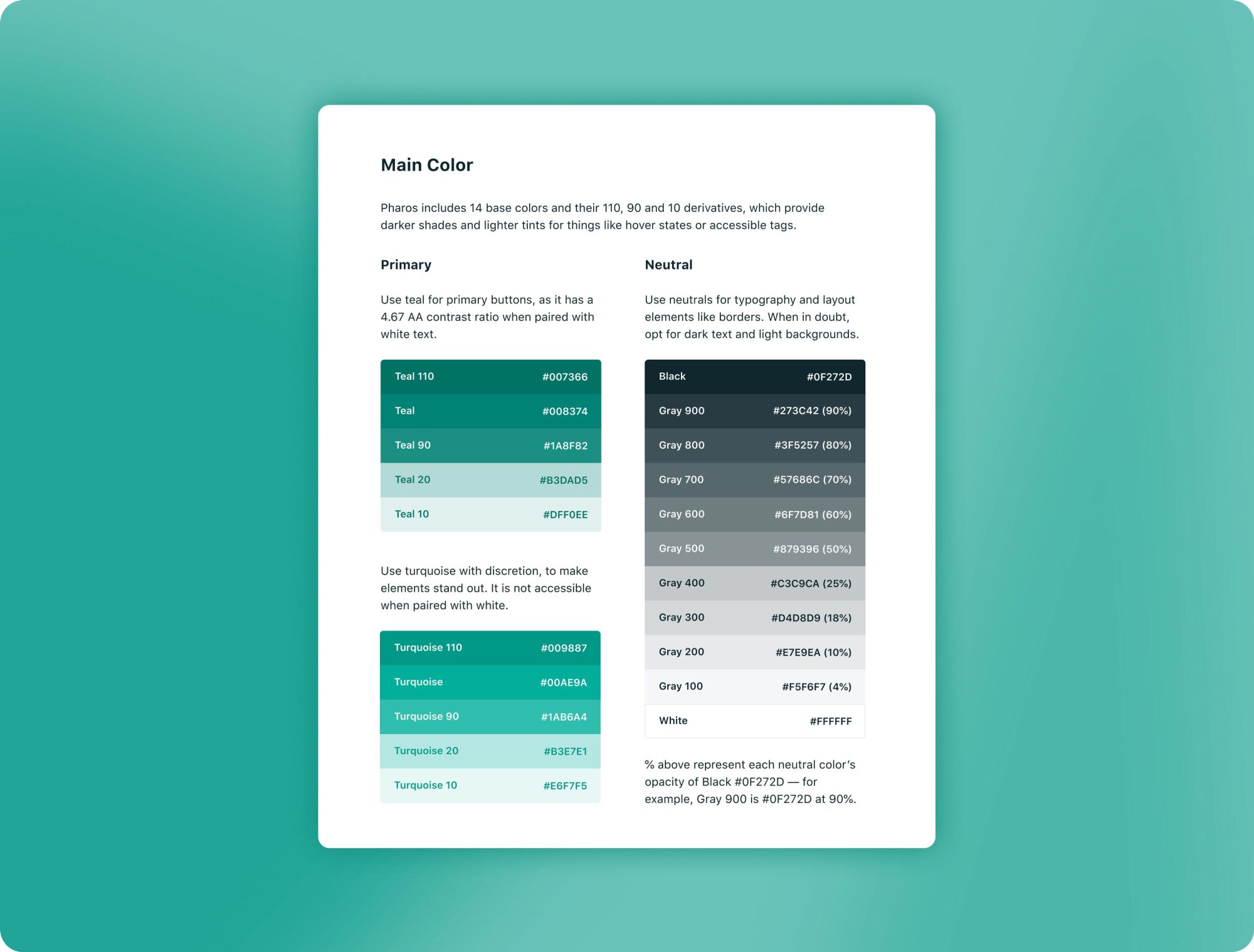
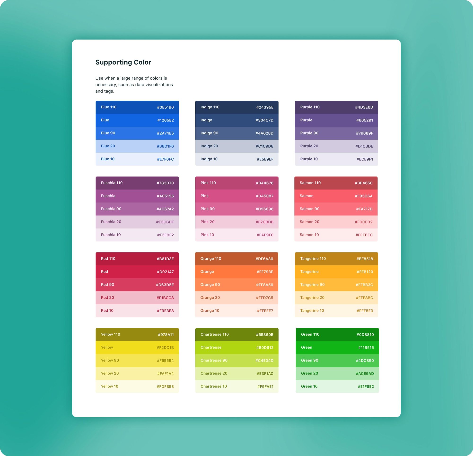
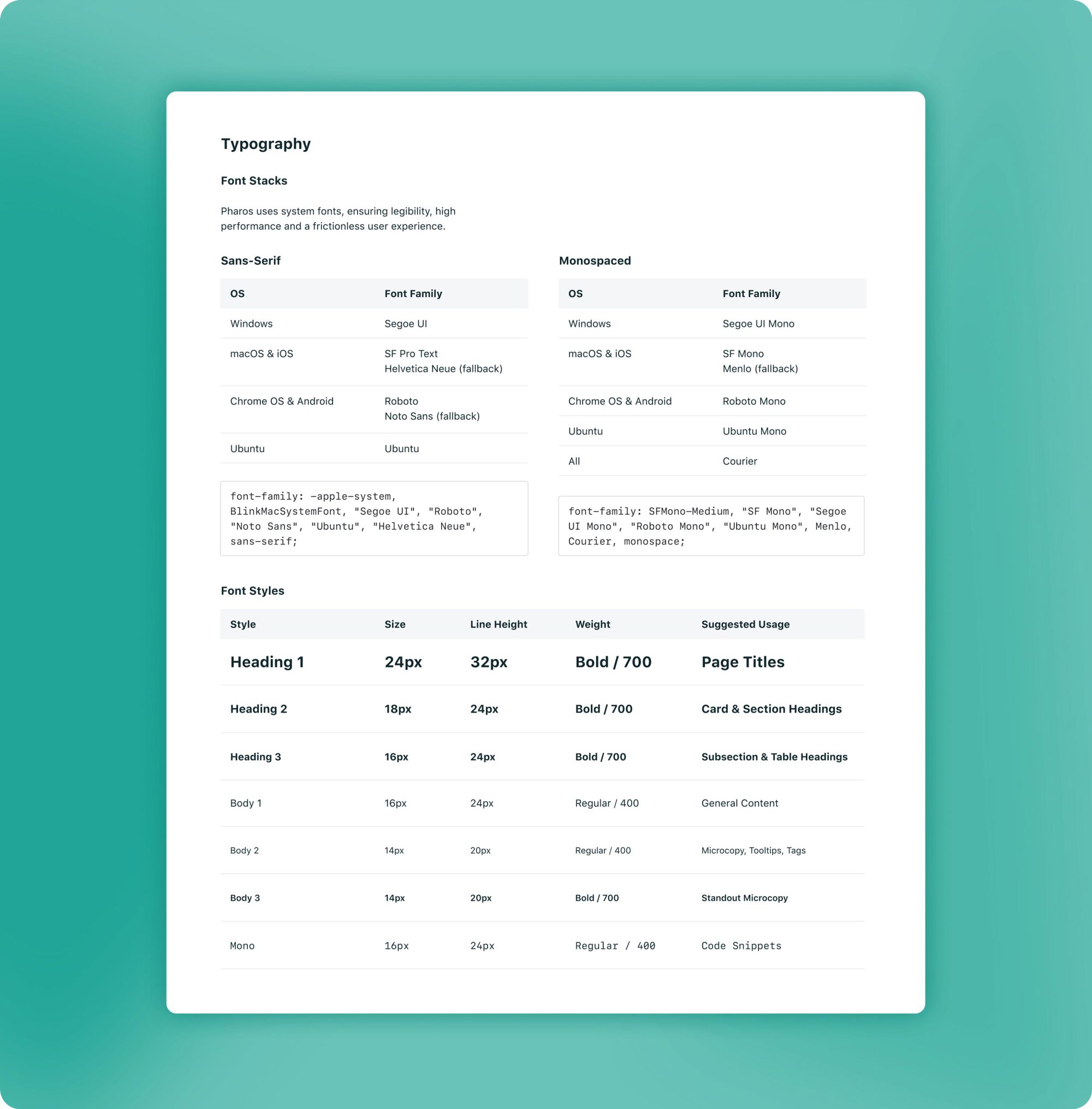
I began with color, text and space styles, using Figma's excellent style libraries. I aimed to stay true to the established product brand while developing appropriate, accessible styles for product design.
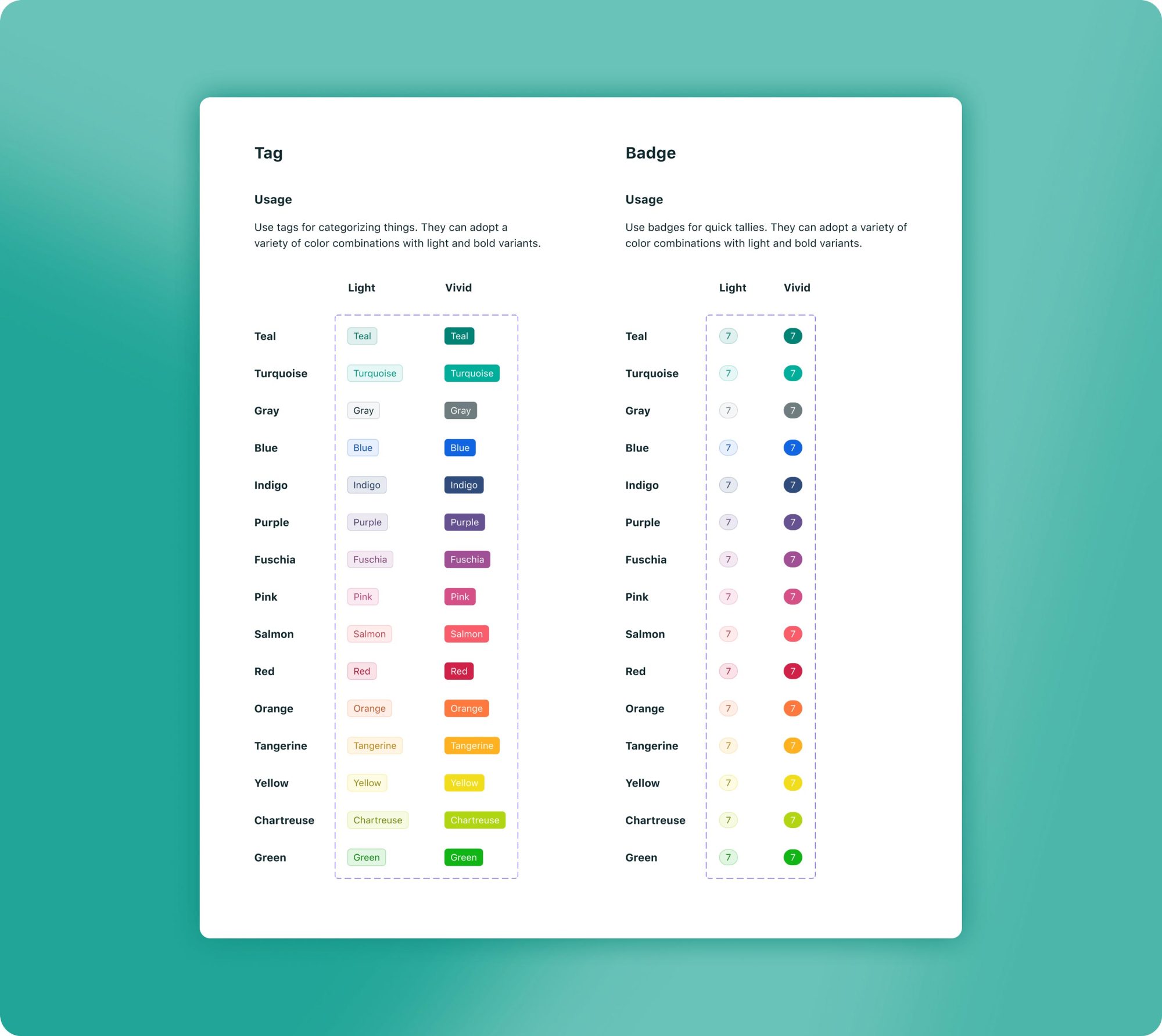
Phase II: Components
—
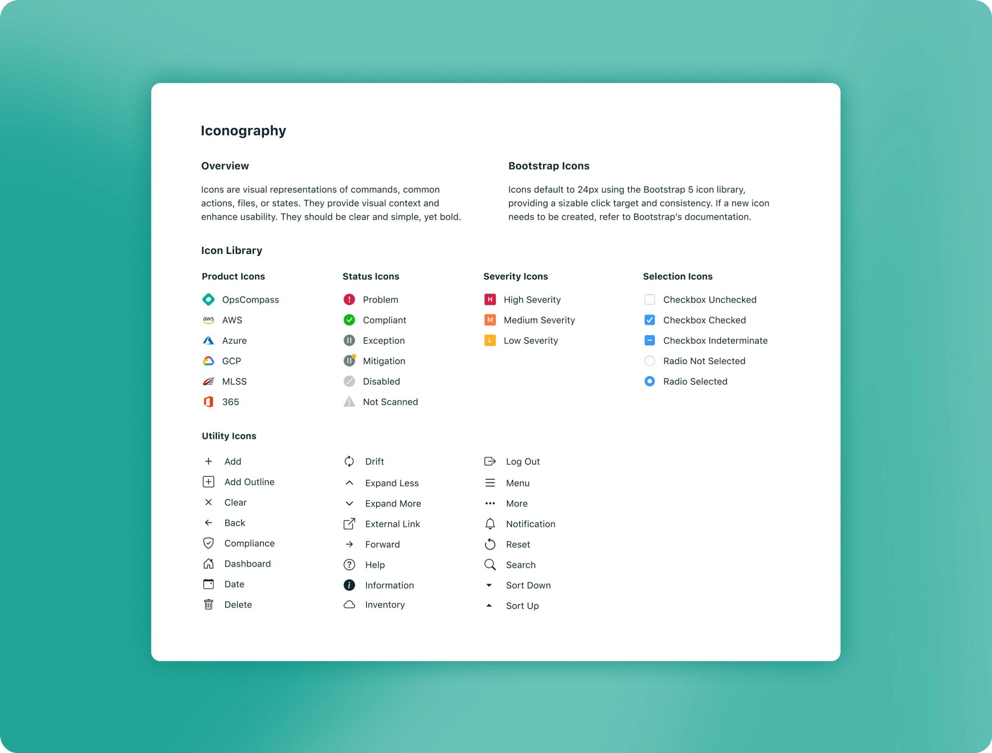
Once I'd determined Pharos's base styles, I jumped into iconography and buttons. With help from our front-end lead, I determined using Bootstrap icons and basic components would be the smoothest path toward implementation.
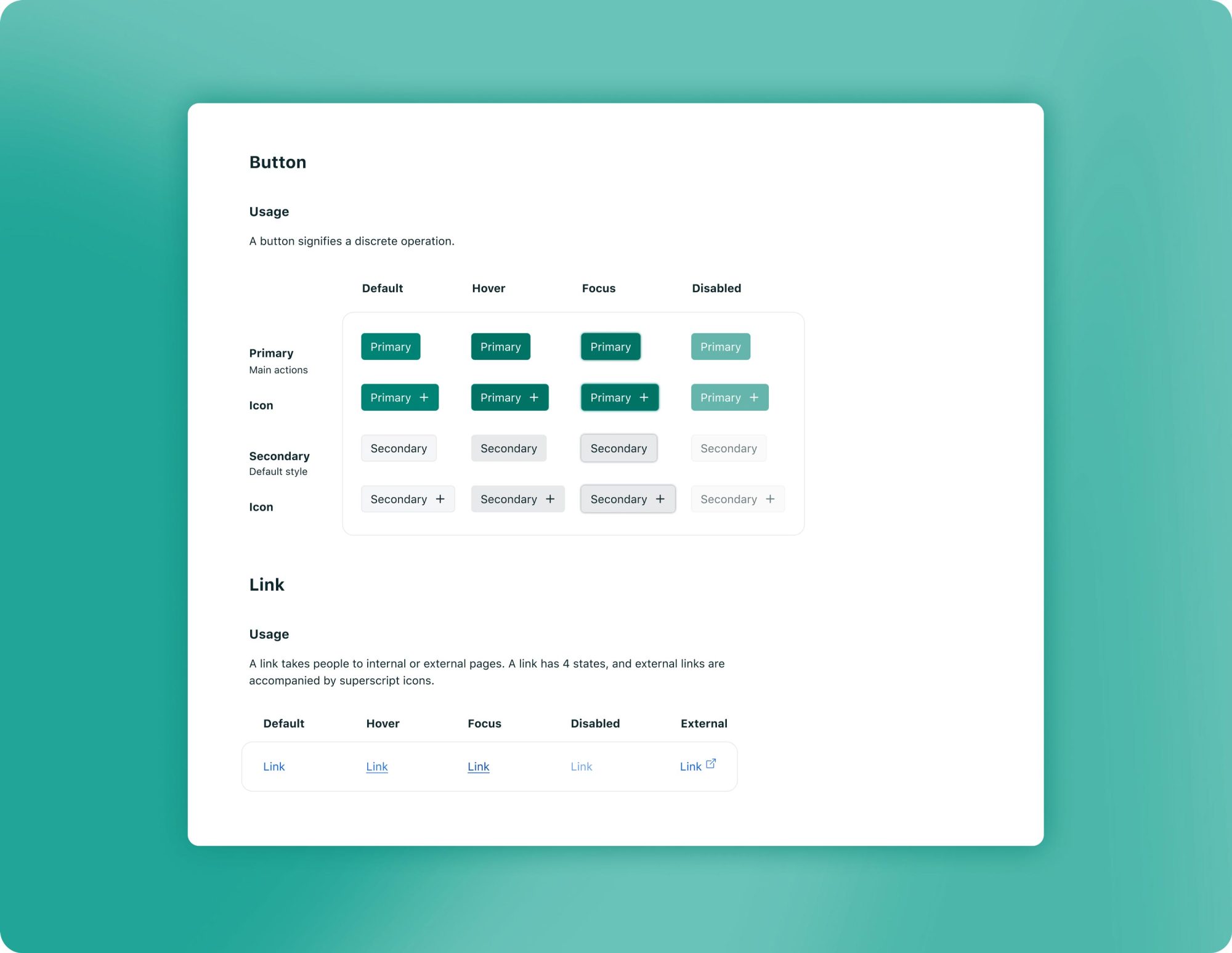
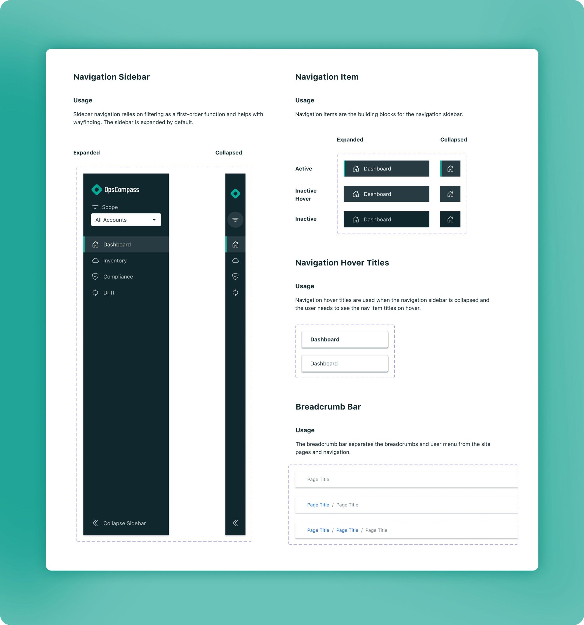
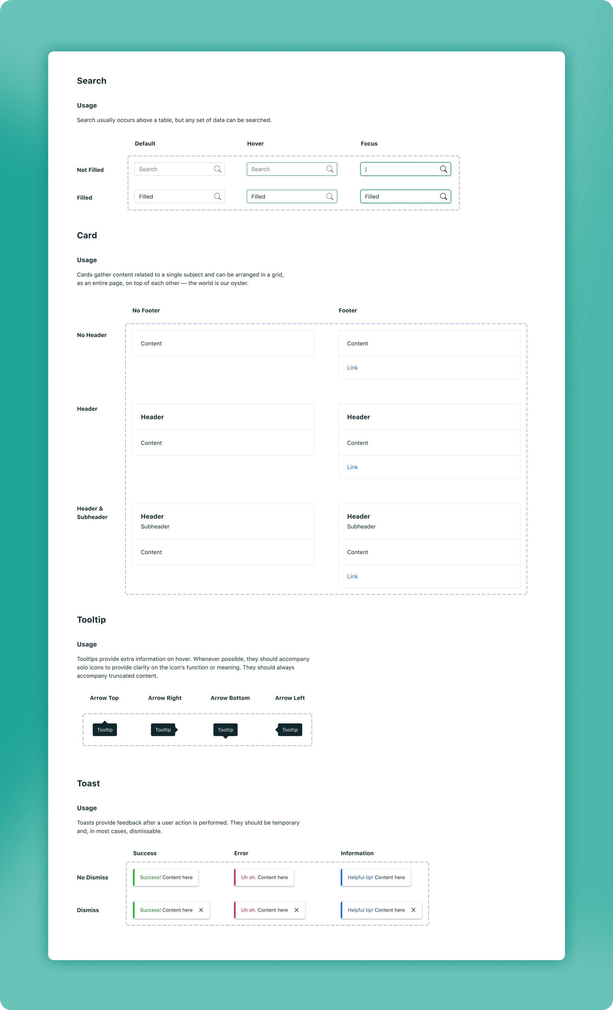
From there, I prioritized layout components like global navigation, content grid and cards, along with form field elements and tables. Being deeply acquainted with the UI, I had the freedom to design components as I needed them.
Phase III: Implementation
—
Our product team decided on a phased implementation of Pharos, introducing gradual change as we completed our normal feature work. Using Bootstrap sped up the design handoff process significantly, and I've developed a collaborative Figma workflow with our front-end team to communicate changes in Pharos.

Results
—
Pharos has been foundational in OpsCompass's growth in the competitive cloud space. It has increased product usability, sped up engineering turnaround times, and assisted in both internal and external marketing efforts, proving its effectiveness as a cross-team tool.